Gap Tone on Tone
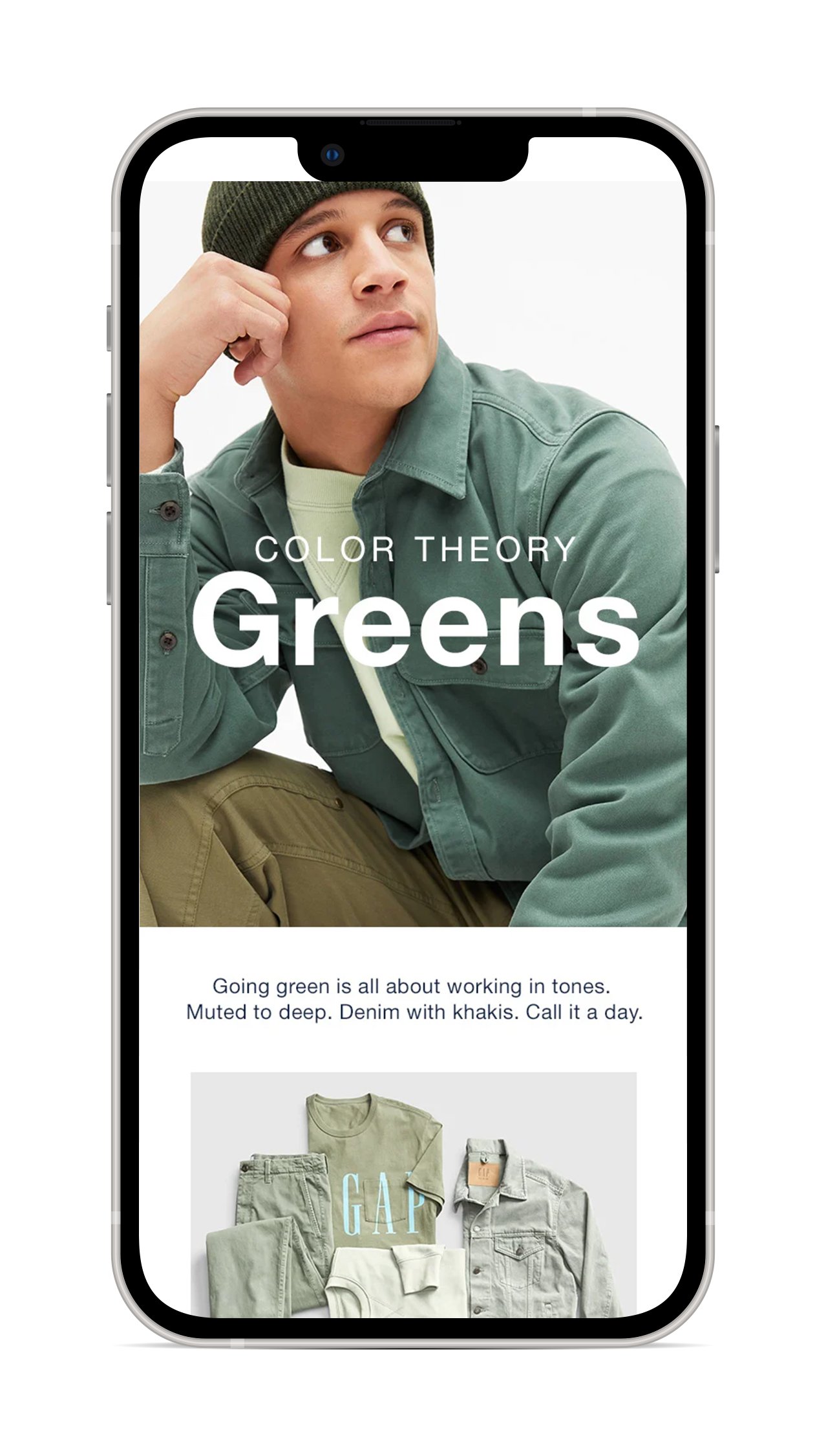
The tonal dressing trend was a big idea at Gap. For the site shop, I chose to lead with a composited model line up—featuring the range of colors—to give a visual overview of what tonal dressing could look like. I followed that with deep juxtaposed crops, hitting off on powerful swathes of color that also showcased quality details and textures.
Site
Email (click to view)


